




An exclusive leaked photo Straight Outta San Mo!
More than three years ago, in the mists of time, there was the Association of Surfing Professionals. It was ruled by the benevolent Brodie Carr out of Coolangatta, Australia and was meet and right. The ASP organized the Dream Tour where professional surfers could leave wives and family and play upon the water and take drugs. It’s logo reflected that surfing was almost like a real sport if you squint real hard and take drugs.

Then one night when no one was looking, the Association of Surfing Professionals was disbanded and the professional surfers were forced to pledge fealty to a new master, the World Surf League. Lorded over by an evil insurance broker from the mid-west named Herr CEO Paul Speaker, the League decided to rebrand as very serious in order to attract South Korean investment dollars and ended up with this logo (seen here in subtle grey and subtle black).

Surfing’s most famous designer, David Carson, declared it “soulless” in a conversation with Derek Rielly when it was first unveiled.
The logo just doesn’t represent the sport very well. It’s pedestrian, unoriginal, forgettable, safe, gentrified and corporate. All things surfing is NOT, at least to me. The zillions of people worldwide, intrigued for decades, who might have felt surfing is unique, are now being shown, no, it’s not. The essence of surfing, the surfing experience, what people feel about it are all belied by this mindless little logo. Do you see people clamouring for tee shirts with it? Stickering their cars, walls, friends, bikes or computers with it? …nooo. It has no particular intrigue nor design unique to surfing.
Did this critique finally make its way to the top? Maybe. For a wonderful friend happened to be waltzing down a certain street the other day and happened to look in a business window formally associated with the League and happened to see a re-imagined series of new possible logos.
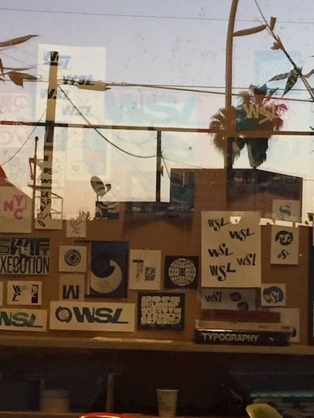
A scoop! A leak! An exclusive! What do you think? Are you inspired?
Me? I’m gonna be honest here… YES! I am very fond of the bottom one second from the left. It looks like it doesn’t care and I like that. I like that a lot.
But back to you. Now’s your chance to weigh in on the future of Peter Mel’s polo shirt!
Commented on Disqus? Log out, tap the Disqus button, and your old name and comments come back. The box is ours.
Your comments are still here. Every one of them.
Twelve years of BeachGrit comments came across from Disqus. Connect and we will show you how many are yours. We get your username, nothing else.
Connect Disqus to reveal.
If the challenge was to create 20 logos using shitty fonts I’d say they’ve succeeded.
Cunts can’t even get there own logo right, straight cash grab making it the association of surfing poolfessionals
https://uploads.disquscdn.c…
hey I’m available.
Please don’t sully your good name with that lot of charlatans!
A special needs kid could piss a better logo in the sand
The new logo got picked up in a scoop!
Nobody will ever convince me that the current WSL logo is better than the old ASP logo. The thing that I don’t understand from day one is how the hell is this a LEAGUE anyway. Last I looked leagues primarily consists of teams. Is it the PGL Professional Golf League, or (gasp) The World Tennis League?
this stinks of a pushy marketing manager (knowing WSL recruitment, is probably ex-pet food company) with ‘big ideas’ making others create digital eyesores. original design is dead thanks to pinterest and ‘bloggers’.
i’m sure this is the reason why david carson lives on an island.
thnkusir.
no, thank you.
they all look shit to me
I can’t see? Have they gone?
looks more like a wall of rejects that the designer liked.
The work experience kid lends them his Typography book and look what happens.
Wait, you walked by the wrong window. This is design board for Weed Smoking Lovers. Its a new dating site. Simple mix up
Inspired by the care free attitude of the Duct Tape Invitational. I hope they asked a graphic designer to create this in exchange for a free ticket to the wave pool tour stop.
W$L would be more apt
You mean the W-$L?
It’s going to take more than Font types I’m guessing. If Alex Knost isn’t too busy yard sale shopping for his next art show I would say let him try. Wipe some paint here, maybe there, cut up some brown brown into letters, and presto.
A job best left to Noa Dean and his box of crayons!
Much like the Surf Ranch, the biggest flaw of the WSL’s new logo is its convenience. Surfing should not be convenient.
What would 89 world champ Martin potter think about convenience in surfing….joe?
That’s a fine whine but the 89 world champ Martin Potter beholds the sight of Surf Ranch with sore eyes, and there’s nothing convenient about sore eyes.
I will leap all the way up to Venice-adjacent if they don’t!
Unrelated, but I just happened upon your story in the SJ archive from issue 24.1, the one on Raimana. I would say, with fair certainty, that it’s my favourite thing of yours I’ve ever read. Truly great.
I’ll repackage and repost here today…
Excellent idea.
I haven’t read — but it will be hard to beat the Lisa Andersen piece, also in SJ, which I really loved.
Too too kind. Thanks.
It’s awesome have you read his profile of the drop knee bodyboarder who belted Slater in Momentum? That shades all.
Point me to it…
I wonder if Derek or Chas has it archived? I don’t know where it is.
Paul Roach.
New promo poster put out by WSL over the weekend…
https://uploads.disquscdn.c…
This is totally amazing.
Turtlely Amazing.
Torture Amazing!
That’s the shirt we’d all buy. (If we can get min 25 orders, I can get it made through a mate for $15AUD + postage)
I deliver to the guy who handles the wsl returns. Would like to see the look on his face when he thinks this is the latest design…
I would wear the shit outta that.
That’s awesome.
Is Ross CJ ok with them using a photo of him, since he’s not on the tour?
Wow, Strider has really let himself go…
…or he improved his look.
fucken hell Karl you really are the King
Where did you procure this unsolicited photograph of me?
Artist rendition of 1989 World Champion Martin Potter inventing the aerial
wsl deserves comic sans font.