




Oh but let's just please go out for drinks instead!
A good blood feud sizzles. The aggrieved parties stand across a ballroom from each other, Hawaiian shirts unbuttoned one extra button, ready to dance (Surfer vs. The Intertia) or across an ocean smashing their thumbs into social media accounts/freestyle rapping (Jay Alvarrez vs. Ethan Carlson).
This here ain’t one of those and I will use this bully pulpit to try and end it, bringing peace to our surf world once again. But first, let me catch you up. Peter Schroff is an iconic southern California surfboard shaper/artist from the 1980s. I have never met the man but remember another iconic Peter, Taras this time, showing me Schroff Surfboard advertisements in old issues of Surfing magazine. They soared! Black and white, edgy, funny, amazing. The logos were better than I had ever seen in surf. I couldn’t believe, in fact, that I had never seen before and I also couldn’t believe that no one was re-creating that look today.
Schroff had disappeared, I was told, and doing other things outside of surf. But then in 2010 he came back and his boards still look like works of absolute art and his graphic design is very very on point.
Hayden Cox is a very handsome young man and sits atop a nouveau surf empire. Hypto-Krypto, baby. Craig Anderson rides his boards and they are not just boards but technological patented things. Hayden also has a fine eye for design.
Just look at his new shop here!
Now. Schroff claims Hayden uses one of his logos for his new wetsuit line and Schroff is very very very angry, filling his entire Instagram account with daggers/hashtags aimed at the young man.
He criticizes Hayden for the artistic theft, sometimes poking fun (like drawing the Apple logo and the Nike swoosh and saying that he came up with new ideas for the line) sometimes angry, sometimes honest, telling one of his followers, “We cud give a flying horse shit if someone used it in another field than the surf industry, sweetheart, in fact Photo Impact studios used it in the 80s and we had no issues. All HS have to do is stop using, apologize & carry on. We only slam folks that ask for it, we got better things to do.” Before jumping on a “made in China” screed.
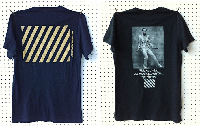
Hayden, for his part, has taken the dignified path, refusing to respond.
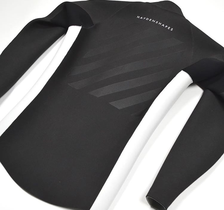
And, gentlemen, if I may…
Crusty, low level, hashtag rage is unbecoming dear Peter! It belies a bitterness that we have all seen on our grandparents and thought, “Yuck! Never me!” But somehow most old people slip into it like comfort shoes. I’m not saying you are bitter I’m saying you look bitter and sometimes looking bitter is worse.
Quietly pretending there is no issue is unnecessary dear Hayden! Your wetsuit logo, which, let’s concede, is more a graphic than a logo for it is a limited-run of suits not necessarily created to make buckets of money, does appear similar to Schroff’s design even though you could be (and are!) forgiven for thinking horizontal lines are probably not patented.
Look at the sunglass label Sabre. They too like lines!

But please, please don’t just change it and carry on. Use this opportunity to do a collab maybe with Peter. Dig further into his archive, make something together! I’m telling you, there is gold in them hills!
Let’s all three of us go out and get some drinks! The first three rounds are on me! Let’s laugh and toast a brave new future! Let’s all let it go, let it go! We can’t hold it back anymore!
Oh! And here’s stripes from 1915! A very early Schroff piece?
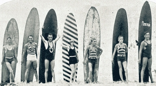
P.S. You are both welcome to use our Bitchy Crab.

Commented on Disqus? Log out, tap the Disqus button, and your old name and comments come back. The box is ours.
Your comments are still here. Every one of them.
Twelve years of BeachGrit comments came across from Disqus. Connect and we will show you how many are yours. We get your username, nothing else.
Connect Disqus to reveal.
That’s entertainment!
Haydo clearly using the amazing Aussie influence of road workers. HI-VIZ collection next!!
Indeed , the construction is piss-poor- had a customer bring me in a buckled PE to replicate in a sturdier construction ( hand laminated EPS).. How old is this thing, I ask? 5 weeks is the reply… You’re fucking kidding, right? It looks 2 years old, and you’re not the least bit annoyed after spending 800 bucks. The apocalypse is upon us…
Schroffe is bitter. Hayden makes good shapes but the construction is horse shit. I would never paid full price for one but have been fortunate enough to get a few on the cheap. Broke two future flexes in waist high surf after using them a few times. Thank the lord that I didn’t pay $800 USD for them. Also have a PE construction board that dimples when you squeeze it and comes in from every fucking session with a new crease somewhere on it. HORSESHIT!
Out of curiosity, anyone else seen a drop in HS board count in your local lineups? There was an explosion in my town, then one by one guys were selling them off for large amounts claiming digression. I tried one once wake surfing but paddling that skim board was a no go. Seems like …lost has the lead with channel islands in 2nd here in sunny Florida.
Still plenty here in Northern NSW
If your gonna use diagonal lines as a logo or graphic id recommend proceeding with ‘caution’…😉
It might be too late now, I think most of the posts have been removed but there was quite the grudge match between Dane’s filmer, mini and a few other filmers from that area on IG. Even had a #miniisadick hashtag going around. you guys might want to look into it, seemed like good click bait
I jumped to this. Kanye’s boy Virgil has been doing stuff al la this under “off white” for a couple of years now. Possibly a more likely source of inspiration?
Young Pama and some other surfers once played coat hangers for the brand.
Yay!!! Blood Feud!!!
Diagonal lines in a box has probably been used many many times before. It’s hardly cutting edge or world changing.
Next up in Blood Feud: Schroff Vs. Zebras!
Yeah, but I’m down to see people insult each other on social media over trivial things. Makes me feel like a bigger man.
And any parody of an entrepreneur as Jesus gets a thumbs up from me.