



Must see to believe.
The International Surfing Association, headquartered in La Jolla, California, is not typically known for extreme pivots, jaw-dropping announcements, but that all changed last night when it shocked the world with the revelation of a brand new logo.
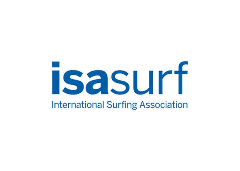
The controversial new design was was immediately pounced upon by the global press with some calling it “brash” and others “foolhardy.”
ISA President Fernando Aguerre was forced to address the growing frenzy, issuing a carefully prepared statement.
“Surfing has come a long way in my journey with the ISA, and with all change taking place in the world, we felt this was an opportune time to update our image and identity. We need to represent the current – and future – state of the sport as we expose fans from all around the world to surfing, many for the first time, at the Olympic Games. We have embraced surfing’s ethos of simplicity and youth, which is effective across the array of digital mediums whether a smartphone, tablet, or desktop screen. Paying homage to our original logo, which withstood the test of time for more than two decades, we maintained the same hue of blue that draws a strong connection with the ocean and nature.”
It did little to quell the cacophony.
A video was then released, attempting to further explain the artistic choices.

It only added gasoline to the fire.
“It is as progressive as it is functional…” one critic declared.
“Offensive! It’s visually offensive and represents toxic masculinity…” another parried.
We live in extremely partisan times.
More as the story develops.
Stretch? Not even close. One could not get further away from tm in fact. But somehow I think that’s the joke, although a dud.
Too few paid attention to Hitler’s rebrand until it was too late.
Surf Nazis must die ✌️
Papyrus.
Just… try this.
https://youtu.be/jVhlJNJopOQ
Does the isa have a world champion?
I’d happily follow those surfers over the wsl billionaires tour
It’s just that you seem surprised by Charles’ schtick.
1. I’ll remember that when you need to borrow some flour or something.
2.fair enough.
3. What could possibly be ‘better’?
I think they maybe referring to the short promo vid as toxic, but geez, it’s vanilla as fuck
Government has gone to ground over rape and corruption allegations plus dealing with the floods.
Billionaire Ziff and man on the ground for Aussie taxpayers handouts starky might have to put some posters up around the town themselves
Have you been hacked?
3D effect with a multicoloured gradient and drop shadow makes everything better instantly.
Just proves people can be offended by anything
No no this is ridiculous.
They spelled “Sarf” wrong.
D. Carson? Are you there?
horrible generic logo with an overused bad font, appears to have just been typed in. souless .nothing to do with surfing. olympic audience mite go really? i though surfers were a little more unique/orginal.
as bland and forgettable as the wsl trophy logo thing
Just for reference, what would’ve you charged the ISA for a makeover?
Can I come by and borrow a cup of sugar please? I have a cake to bake.
What work do you do that has no other surfers in it?
Or perhaps they are so on the DL that they are playing stupid.
My girlfriend’s name is Isa. I wish she would surf.
Careful what you wish for.
Can we take a break from framing Dirk as surfing’s villain and shift focus to Fernando?
Not yet.
I’m rooting for the ISA this Olympics… Fuck the WSL!!
is that a logo? if i type my name here, in a new font, is that my new logo? or is it me spelling out exactly who i am with slightly different stylings to the letters that i used before? no more as the story unravels…
Looks like the most non-controversial controversial thing I have ever seen. That’s about as vanilla as vanilla gets.
I’m disappointed my logo design concept – which was a nude, big titted zombie holding a machine gun, wearing a top hat and being spat out of a heaving barrel on a penis-shaped surfboard – was not incorporated, but I will continue lobbying the ISA to embrace the change its members really want to see
https://uploads.disquscdn.c…
I thought I told my tattooist not to share that
Those mermaids seem to lack a certain hydrodynamic sense of flow.
Mermans!
Rudder.
Our species never ceases to amaze me.