Or how your fav bear Jew got a New York City vibe…
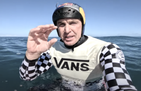
It’s hardly a secret that, long ago, I beatified the San Clemente shaper Matt Biolos aka the Bear Jew. Anyone who can build a craft that fits into my skewed vision of surfing – I like ‘em wide, but thin, ultra-low rockered though the front three-quarters but kicked in the tail – deserves adoration. If you’ve ridden one of Biolos’ …Lost boards you’ll know. A sophistication that comes from a clarity of vision.
To cement his every-man appeal, Biolos, and his pal Mike, own the company. Biolos designs the designs. It’s as grass roots as it comes at this level, something rare as hell in a biz where Quik/Billabong are owned by the same investment fund.
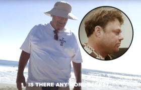
Chris Gentile, you’ll know if you live and surf in New York. He owns the Pilgrim Surf + Supply store. A real pretty, real city Brooklyn emporium of surf. Gentile a little, a lot, like the adult film legend Aiden Shaw.
Gentile and Biolos aren’t the sort of figures you’d immediately put together to collab. Biolos is San Clemente, punk, raw; Gentile is urbane, gloss coats, jazz.
And, yet, though the miracle of social, the pair just connected. “We made some comments on his Instagram handle and started a dialogue that way,” says Gentile, who might rival even your old pal DR as a Biolos fan. “Matt is truly fantastic,” says Gentile. “He was one of the first guys if not THE to make high-performance boards that worked well for the average surfer like myself! He’s a master! I replay the Andy Irons and Cory Lopez section of 5’5″ x 19” 1/4” (on the Round Nose Fishes at Waimea Shorebreak) in my mind when I’m trying to fall asleep at night! Matt is super open-minded, creative and forward thinking. He cares deeply about the culture, its history and pays respect to all that has come before him. “
So, when Biolos was on an East Coast tour last year, the pair met, and they cooked up a …Lost-Pilgrim collab.
“I love making cool shit with cool people,” says Biolos. “I really appreciate well-curated retail stores and well merchandised products and stories. I think Chris brings a unique passion and ethos to his presentation. He seeks out creative people and challenges them to leave their comfort zone.”
As for Gentile, oowee, wind him up and get him started with real talk. He wanted the collab so the sniffy, aesthetic-minded Brooklyn surfer, who lives or dies by the design of his decals, would get turned onto Biolos’ brilliance.
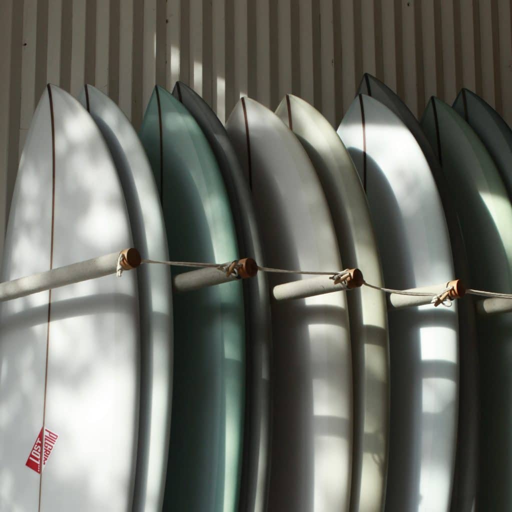
“Matt is one of the greatest performance board shapers of all time. I really wanted to celebrate his designs and craftsmanship by toning down the aesthetic in the logos and treatments so that the shapes themselves were the focal point. There are so many people that can put a …Lost under their arm and say to themselves, ‘Holy shit this is an amazing board’ but then get hung up on the fact that the lams (decals) don’t speak to their aesthetic sensibilities. As lame as that sounds its a real thing so why not make make something that will still perform incredible well with minimal branding that will break down that barrier to entry? Don’t get me wrong, I love the …Lost brand aesthetic because it’s authentic, brash and not trying to be up to date with the affected graphic treatments we see allover the place. Its Honest. Its Matt.”
I ask Biolos, whose father was raised in Brooklyn, to describe the various NYC surf scenes.
“Ok, Brooklyn is not a surf spot, but lots of surfers now live there. Like Tokyo City, or the Vally in LA, they have thriving scenes. The surf is on the Island. Rockaway to me was always a rough and beat-down zone. I spent time there 25 years ago. Met Tommy Senna, who has held down that zone forever. He’s a quirky guy, and most the surfers there (then especially) were low-skill level, low income, dare I say kooky types. What has happened since the young urbanites migrated from Manhattan to Brooklyn, it is became cool and these city surfers started bringing their educated, refined tastes and affluence to surfing and the Rockaways. You got the Rockaway revolution of, for lack of a better word, “Hip Surfers”. People who are passionate about surfing, have money, education, fashion awareness and the high taste level associated with Manhattan. Although I tend to think the majority are still lower skill level and the surf still is sub par on that part of the island.”
Montauk and out east?
“Here you’ve got a place that for ten weeks of the year looks like a scene from the Great Gatsby parties. The rest of the year it’s like the Blair Witch Project. Winters are very rough and much of the population is seasonal. Great set ups for surf, though: point-breaks and deeper water reef type set ups. Really nice. Great place with cultured people and extremely high taste levels and affluence, but with the part time residents. Think. Natalie Portman and friends. It really needs swell to happen. This makes for a lot of small, crumbly point waves that lend them selves to big beautiful logs and wide flat fish. So you see a lot of that out East.
“For me, the real center of NY surfing is mid island. Long Beach to be precise, but there’s other stretches of jetty lined beach breaks as well. The best surfers and most consistent surf is in this area. This is the zone where you see high-performance shortboards and little rippers ripping them. Balaram Stack is a Long Beach kid. It’s where the WCT event was held and The Unsound Pro happens each year. It’s where the best surfing is being done.”
What sorta boards we got in the mix for the collab?
“Chris wanted boards that would be considered high-performance but still manageable in the inconsistent New York surf by average skilled surfers. We went with the Puddle Jumper Round and the Quiver Killer, but added some unique tail shapes to them. We built them using tapered stringers, made from dark soft wood and reverse engineered the cut laps to counter balance the stringers. Chris chose the color palate and his team created the logos with my limited input approval. I didn’t want to trample his vision. Paul ” The Son of Cobra ” did all the glass work himself. Lam, hot coat, sand…everything. They are spartan in the way that there is very slight logo-int, and the finish is a simple hand sanded texture. Like a team board.”
But, says Biolos, The bottom has to be, no matter how god they look, the boards must perform. And they do.”
