
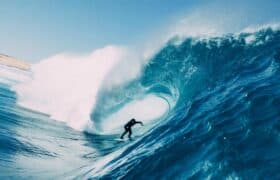


Carson joins titans of the creative game including directors Martin Scorsese and Spike Lee on Masterclass…
The surfer David Carson is the world’s most imitated graphic designer, at least among magazines that do “hip” and “edge” and who like to break every typographic rule there is while straight-jacketing themselves to another set of strictures.
Carson, who is sixty-five, re-tooled Surfer magazine in 1991, Matt Warshaw calling his work “jarring but innovative”, and added “a majority felt, as one Pasadena subscriber put it, that the new look was “jumbled, ugly, chaotic and hard to read.”
The prestigious Harvard Graduate School of Design asked Carson to create publicity and posters. Apple called him one of the 30 most Influential Mac users ever. London Creative Review magazine named him the most famous graphic designer on the planet.
A big name, therefore, in the design game.
Now, thanks to online education platform Masterclass, you can sign up for thirteen lessons in graphic design from the little master whose surfer bona fides are proved by the fact he was once invited to the prestigious Smirnoff Pro Am in Hawaii.
Lessons include, An intuitive approach to design, send a message with typography, using photography in design, developing a logo, life as a working designer, tapping into the power of colour, collage art for designers, working with clients, designing impactful magazines , designing your future and making it happen.
A hundred and eighty, US, buys a yearly sub to Masterclass, which includes skateboarding with Tony Hawke, shooting threes with Steph Curry, how to make grits with Gordon Ramsey, self-expression and authenticity with Ru Paul and so on.
As the island bunkered down to fight the spread of Coz-vid number nineteen, Carson flouted its six-day long twenty-four hour lockdown law to ride empty three-to-four-foot CGB, posting the event on his Instagram page.
Six years ago, Carson designed, at BeachGrit‘s behest, 151 new logos for the WSL.
The existing logo, he said, “has no soul. The logo just doesn’t represent the sport very well. It’s pedestrian, unoriginal, forgettable, safe, gentrified and corporate. All things surfing is NOT, at least to me.”
A surfer to the bone but also with a few things to say about making pretty pictures.

Commented on Disqus? Log out, tap the Disqus button, and your old name and comments come back. The box is ours.
Your comments are still here. Every one of them.
Twelve years of BeachGrit comments came across from Disqus. Connect and we will show you how many are yours. We get your username, nothing else.
Connect Disqus to reveal.
I’m more an “Isaac”!
Coffees?
I went back to that 6 year old article. Two things were interesting.
1/. Not so many of those guys still haunting these pixel pages, NC, ACTIVESHOOTER and samwaters, from memory.
2/. Ashton Googans wrote an article just before it. It was pretty clunky.
carsons / album boards are masterclass in surfboard designs
Anyone who references “The Love Boat” gets a thumbs up.
Forget graphic design, I’m more interested in who will teach the upcoming masterclass in BG commenting. Wiggs maybe? Who has the highest upvote to comment ratio?
Bexy
when did being dyslexic start being recognised as an art? none of my teachers ever suggested it to me, It was generally assumed it meant I was a dumb cunt.
Fucken hell Dez – when will the dick licking stop ?
You cunts can’t help bending over whenever these leaders post something.
Pfft – David Carson is nothing and meaningless in today’s world.
BG fail
Edit; otoh I would prolly really enjoy the course. So (shrug) …
I’ve seen it so many times here, some surf identity graciously allows themselves to be interviewed by Beach grit. Then posters like us get stuck into the surf identity for being a wanker in some form. Next time they appear on BG the article will slag them off.
Elo got positive write ups until everyone told Chas he was kissing too much arse. Next minute, Elo gets shit hung on him.
Sam George gets a positive write up initially but can now ‘suck it’.
Dave Carson will probably get slagged off next.
Maybe you confuse smugness with the look of someone who’s fcuken good at what he does.
I think the soup cans guy was Warhol. Though Frank Kozik did copy it on a poster he did for Nirvana on the in utero tour. Frank Kozik was an absolute boss. I think he stopped doing posters and moved onto painting toy dolls?
… George Lois’ ‘Esquire’ cover on the decline of the (’60s) American avant-gard, comes to mind.
Sorry David, I don’t have the cash to throw at it.
Would you take a firm handshake and a warm shaka? Some recycled surfwax? A couple of Hurluley stickers?
The weirdest thing is if you follow the links it comes up with all these articles by Ashton and Rory. I thought they were the enemies?
Some really radical burns in the comments section too.
I’m biased on the creative side, but tell us who among us has a better set up in life, surfing-wise, then DC?
Edit: Forgot a comma
Also: ‘than’.
Got to admire the man who said
“ I am still riding a shortboard and I will for as long as I can .”
Just goes to show that even old men can short board if they don’t have to compete with 40 kooks under 50 riding mid lengths and logs ?
You are right! For an aging surfer all he has to do is walk down his drive and hop over a few rocks. A big leap, couple strokes he is at the top of the point. Most everyone else has to make the long paddle around as gate blocks the walk up to the top. He has been more than gracious to myself on my visits to his beloved surf spot.. Cheers mate!
That split cover of Surfer mag in 1991 with the new font was probably the high water mark for the mag. Some of his later stuff is a bit too over the top. I think he designed an article on TSJ (?) but it was all scribble and a bit too cool for school. But I think his work is brilliant.
Rick Griffin is more influential in the surfing genre though. Even 30 years after his death people are shamelessly copying the surfing eyeball and Grateful Dead stuff.
I collected surfer mags from 1975 to 1991 when it went to trash and I stopped buying it.
the mag truly became ugly and unreadable in my opinion.
high water mark was 1989 for the mag. Team Warshaw and Marcus
Eric logan – Cat herder
I saw that Gwenyth Paltrow had a masturbation class on her Goop Lab program.
That’s so Goop.
Uninterested in Carson as a graphic designer. I thought that him ignoring the moronic covid lockdown to surf empty CGB was classic.
He immediately lost again all core points by posting it on Instagram.
Many core points lost by posting on social media, definitely. Core points would have increased had he let the media post the story of him getting busted, without saying a word about it in public.
The existing WSL logo, he said, “has no soul. The logo just doesn’t represent the sport very well. It’s pedestrian, unoriginal, forgettable, safe, gentrified and corporate.”
Seems to me that logo perfectly represents the WSL
We need a Rick Kane redesign.
Didn’t read the article just wanted to be first in the comments
Words to live by.
I appreciate your pioneering spirit!
You gonna write about the Shane Herring / Webber collab?